
FABLE III - MAIN MENU REDESIGN
SCHOOL PROJECT - CASE STUDY
Game Design • UI/UX • Prototyping
OVERVIEW IN CURRENT STATE
In Fable III, opening the game menu does not bring up a traditional UI overlay. Instead, the player is teleported into a separate scene called The Sanctuary, which functions as a fully explorable “menu hub.” The Sanctuary is part of the game’s narrative and serves as a diegetic menu design.
Each major menu function is represented as its own room, and there are four rooms total: Armoury, Dressing Room, the Treasury, and the LIVE Room.
These rooms are all connected to the Main Chamber, where the player spawns when opening the menu from the game scene.
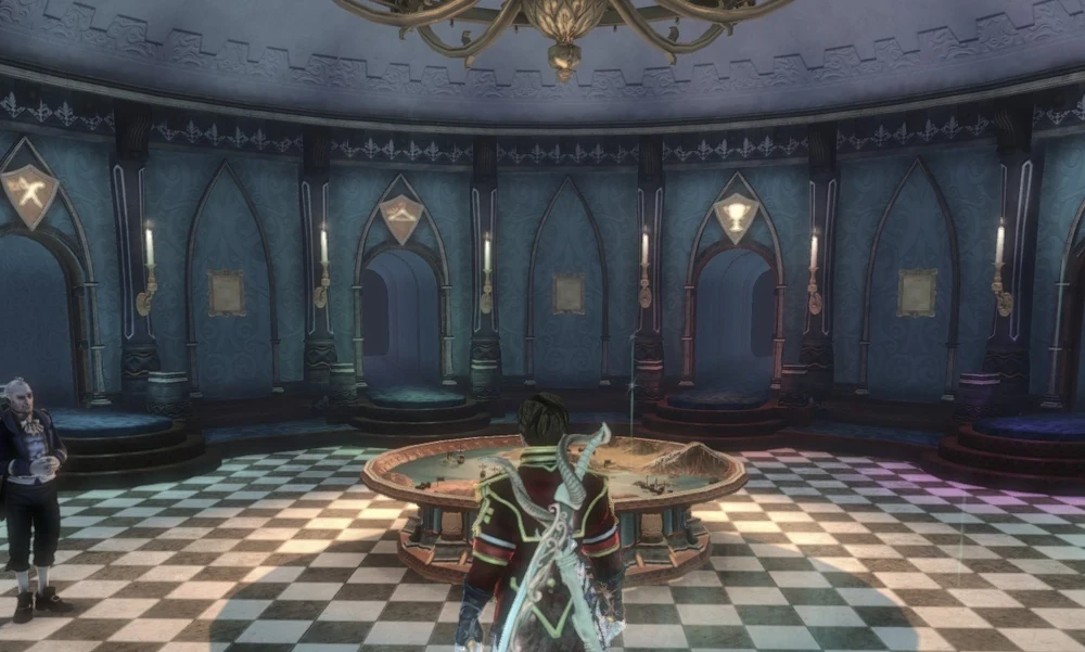
Screenshot of the Sanctuary in Fable 3
SPECIFICATION OF DESIGN PROBLEM
The Sanctuary is a unique and immersive design, but it was met with mixed criticism for being slow, clunky and tedious and even though the loading times on Xbox 360 were short, they were still noticeable for players.
Opening a menu should never feel like it slows down the game, especially in an RPG where menus are used constantly.
Breakdown of the Sanctuary
Main Chamber:
Map table:
Used for quests, fast travel, and real estate managementStatus panel:
Shows the player’s current character statisticsOptions panel:
Includes game options and the save feature
From the main chamber, the player can navigate to the following rooms:
Armoury:
Contains all weapons and gauntlets the player ownsDressing Room:
Used for equipping clothes, hairstyles, beards, make-up, and tattoosTreasury:
Stores all of the player’s achievements, trophies, and goldLIVE Room:
Handles online features
PROPOSED DESIGN SOLUTION
Instead of teleporting to the Sanctuary every time, pressing the menu button opens a radial quick-access menu directly on top of the game scene. This makes all core features available instantly, and most menu options now open directly in-game instead of loading a separate scene.

Final concept design of the radial menu
THE RADIAL MENU
The redesigned menu system introduces a radial menu with four main categories. Since Fable III is a console game, a radial layout is intuitive and works naturally with a controller.
A fifth category can be found at the center of the wheel, which is identified by the Guild Seal. This symbol is an important part of the game’s story and appears on the Cullis Gates, magical portals used for fast travel and entering the Sanctuary. Selecting the symbol opens the Sanctuary.
The radial wheel includes:
Map
Weapons & Gauntlets
Character Status screen
Options
Sanctuary
Benefits from this change:
Opens instantly
Clean and readable
Controller-friendly for console
No loading for majority of options
For this partial redesign, I would keep the Status, Settings, and Options menus as they were originally designed, but move them into the in-game scene as sub-menu panels. These three are already non-diegetic and function like traditional menus. The Map would still require a separate scene due to the amount of 3D visual information it contains.
The major redesign is for the Weapons & Gauntlet section since I felt that navigating through all the weapons, one by one, was too slow, especially since you had to travel to the weapon room first.
When it comes to the Sanctuary itself, I decided that it should remain as it was in the original game. The four sections in the radial menu would still be available to walk to, inside the Sanctuary. This decision was made in order to respect the original developers design, but with the radial menu the overall gameplay experience would become much faster and more accessible.
PROTOTYPE & TESTING
The prototype for the redesigned menu system was created in Unreal Engine 5 using Blueprints and the CommonUI framework. I created a functional version of the radial menu and the sub-menus first. Then I did some early user testing to evaluate how well the redesign worked.
The goal of this playtest was to see how the player would navigate the menu, understand the new design and manage to do actions like changing weapons, settings or checking the characters hero status.
The test was done with a console-experienced players. I asked the tester to:
Open the radial menu
Navigate between all categories
Change game settings
Equip different weapons
Enter and exit the Sanctuary
During the session, I took notes of:
How fast they understood the radial layout
If they appeared confused
If they felt the controller was worked well with the design
After the test I asked follow-up questions about the visual design of the UI, how responsive they felt it was and their overall impression.
The feedback I got was positive, especially how fast and easy it was to navigate. Several improvements were suggested though, including icons for the specific weapon, more information on the Hero Status screen and audio feedback when equipping the weapons.
Based on this feedback, I changed some of the UI visuals in Figma and polished them further and then re-importing the updated assets into Unreal Engine 5. The widget system is modular enough to allow these changes to be implemented very easily.
2D ASSETS & VISUAL DESIGN
The 2D UI assets were designed to stay visually close with Fable III’s original menu style, while making the design more modern and more cohesive than before.
I chose to keep the original games core visual elements. However, I found that the original menus lacked visual consistency and I tried to keep the new visuals similar overall.
In my redesign I focused on:
Creating a clearer visual design
Simplifying decorative elements
Have consistent typography and layout structure across all the menus in the game

All 2D assets created in Figma
The assets were first designed in Figma, allowing quick iteration of the layout, colors, and icon placement. Once finalized, all 2D assets were exported and implemented into Unreal Engine 5 using CommonUI widgets.
The goal was not to replace the visual identity of Fable III, but to refine it.
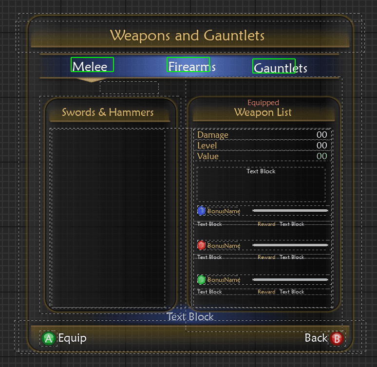
Implementing UI assets into UE5
RESULT & REFLECTION
This project reinforced the importance of balancing immersion with usability. While Fable III’s Sanctuary leaves a lasting impression with its diegetic design that still is talked about even today, testing and analyzing made it clear to me how design decisions that prioritize atmosphere can negatively impact players experience.
With this redesign I learned that improving/redesigning a system doesn't necessarily mean that you remove its identity. Rather than replacing the Sanctuary entirely, my solution focused on reducing unecessary waiting while keeping its narrative and aesthetic part of the game. This approach allowed the redesign to respect the original developers vision while still addressing its weaknesses.
The playtesting phase was particularly valuable. Although the feedback was mostly positive, the small changes suggested by the people who tested it (such as adding weapon type icons and audio feedback), improved the design and responsiveness. This reinforced how even minor UX changes can have a meaningful impact on the design.
Technically, building the system in Unreal Engine 5 using Blueprints and CommonUI strengthened my understanding of modular UI design. Structuring each menu as its own widget made iteration smoother and helped me understand better the importance of flexible architecture when designing interactive systems for a game or setting up a framework in Figma, for example.
PROTOTYPE SHOWCASE
Final visual implementation of the redesigned menu system in Unreal Engine 5
All 2D assets created in Figma
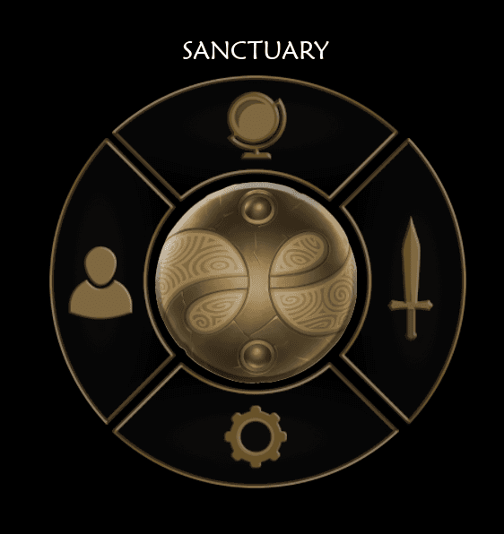
Final version of the Radial Menu

Game Options Main Screen

The largest redesign:
Weapons and Gauntlets can be equipped directly from the in-game world. All information and bonus quests can be viewed at the same time without any extra inputs from the player.

Game Settings based on the original

Hero Status screen